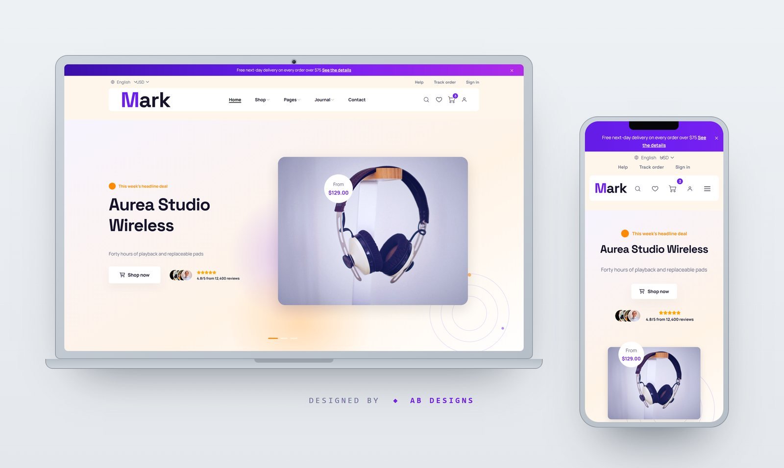
Mark – Consumer Electronics & Gadget Store HTML Template
A trilingual (EN/AR/ZH) 23-page electronics storefront with a filterable catalogue, a full product record, a cart-to-checkout flow, an account dashboard, order tracking and a spec comparison table. Mobile-first, with a fully mirrored RTL layout.
Mark is a complete multi-page storefront for electronics retailers, gadget shops and single-brand hardware stores. Twenty-three pages ship ready — home, the catalogue and a filtered catalogue with a sticky filter rail, a full product record with gallery, specification table and reviews, cart, checkout, wishlist, a four-column comparison table, order tracking, the account dashboard, sign in, register, password reset, about, contact, help centre, delivery and returns, the journal and an article, privacy, terms, coming soon and 404 — all sharing one header, footer, cart drawer, search overlay and quick-view modal. The home page was re-sequenced rather than reskinned: the four delivery and warranty promises move directly under the hero where they answer the first question a shopper actually has, new stock comes before the deep catalogue, the promo banners break the product wall, and the reviews drop to the end where there is finally something to review. Every section heading was rewritten with it, and a twenty-four product catalogue, twelve departments and six articles carry real copy rather than lorem. Every string on every page is translated into English, Arabic and Chinese from a single 393-key dictionary generated at build time, so a label can never drift between the markup and the dictionary. English is written into the HTML, which keeps each page complete and indexable with JavaScript off. Arabic is a true mirror rather than a right-aligned copy: the theme stylesheet is programmatically transformed into a second, fully mirrored sheet — property sides swapped, box shorthands rotated, border-radius corners re-paired, transforms and shadows negated on the X axis — and served alongside the official Bootstrap 5.3 RTL build. Direction is resolved in the document head before a single stylesheet is requested, so an Arabic page never paints left-to-right first and then flips. Sliders receive their RTL flag and mirrored arrows at initialisation, the countdown speaks the page language, and prices, order numbers and rating counts are bidi-isolated so a leading "$" stays where it belongs inside an Arabic sentence. Arabic uses IBM Plex Sans Arabic and Chinese Noto Sans SC, each with its own line height and no Latin letter-spacing; Latin copy pairs Space Grotesk for headings with Manrope for body. The palette was rebuilt from the ground up — electric violet against a vivid amber, both clearing 4.5:1 on white — and applied at source rather than layered on as overrides, so no hover, focus or badge state is left showing the old accent. The layout is mobile-first in the strict sense: the type scale is clamped rather than stepped per breakpoint, icon-only controls are held to a 44-pixel touch target, and every page was machine-checked for horizontal overflow at 320, 390 and 768 pixels in all three languages. All eighty photographs are fresh product, lifestyle and portrait shots, each cropped to the exact box the layout expects and colour-matched as a set; the wordmark is baked to outlines so it renders identically inside an img tag, and the twenty-seven icons, payment marks, store badges, QR block and hero blobs are all hand-authored SVG. The build is reproducible end to end — imagery, icons, stylesheet transform, dictionary and all twenty-three pages are generated by one command that also audits its own output for dead links and missing assets.