Let's build something worth visiting.
Tell us what you are planning. We will come back with an honest view of scope, timeline and cost — before any contract.



27 Marlowe Street, Suite 400San Francisco, CA 94103
27 Marlowe Street, Suite 400San Francisco, CA 94103
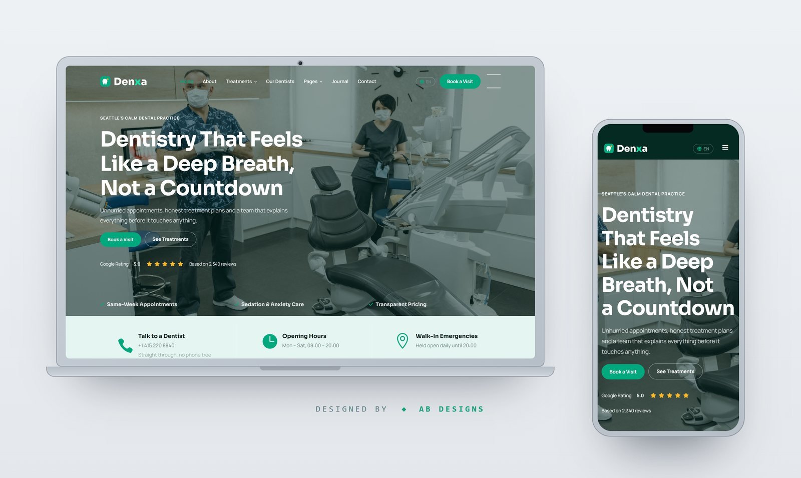
A trilingual (EN/AR/DE) 22-page dental practice template with six treatment pages, clinician profiles, a published fee list, an appointment request flow and a smile gallery. Mobile-first, with a fully mirrored RTL layout.
Denxa is a complete multi-page front end for dental practices, orthodontic studios and family clinics. Twenty-two pages ship ready — home, about, a treatments overview and six individual treatment pages, the dentist roster and a clinician profile, an appointment request page, a published fee list, a smile gallery, patient reviews, FAQ, journal and article, contact, 404, terms and privacy — all sharing one header, footer and design system. The home page was re-sequenced rather than reskinned: the hero is followed immediately by the phone number and opening hours, because that is what a toothache is looking for, then treatments, the practice story, the numbers, the reasons patients stay, a ninety-second tour, the clinicians, reviews, the questions asked before booking, and a closing appointment band. Every string on every page is translated into English, Arabic and German from a single 466-key dictionary. English is written into the markup, so each page is complete and indexable with JavaScript off; switching is instant and needs no reload, the choice is remembered between visits or forced with a ?lang= parameter, and even the labels a screen reader announces are translated. Arabic is a true mirror rather than a right-aligned copy — the stylesheet was rebuilt on CSS logical properties instead of a separate RTL override file, so margins, padding, borders, insets, floats and alignment all flip on their own, while mirrored corner radii, negated transforms, shadow offsets and direction-bearing chevrons are generated to match, and phone numbers, prices and email addresses stay left to right inside Arabic sentences. Arabic switches to IBM Plex Sans Arabic and Cairo with their own line height and no Latin tracking; Latin copy uses Sora for headings and Manrope for body. The layout is mobile-first in the strict sense: the type scale is declared at phone size in the root and grown through four min-width steps, every media query in the authored stylesheet adds capability rather than removing it, and each page was checked for horizontal overflow at 390 and 1440 pixels in all three languages. Three inherited behaviours were replaced with authored ones — an accordion that now closes on a second click and exposes its state to assistive technology, a gallery filter that toggles classes instead of absolutely positioning tiles against the grid, and counters driven by IntersectionObserver that print their final figure in the markup so the numbers are right with scripting disabled. The wordmark, badge, favicon, nine treatment icons and the interface chrome are all generated SVG, and every photograph is a fresh clinical shot cropped to the exact box the layout expects at 2x for retina.
Tell us what you are planning. We will come back with an honest view of scope, timeline and cost — before any contract.
SitexPrime — brand film