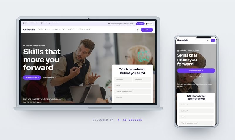
Coursable – Online Courses & Skills Academy
A bilingual, mobile-first landing page for an online course academy — course cards, live cohorts, instructors and learner stories.




27 Marlowe Street, Suite 400San Francisco, CA 94103
27 Marlowe Street, Suite 400San Francisco, CA 94103
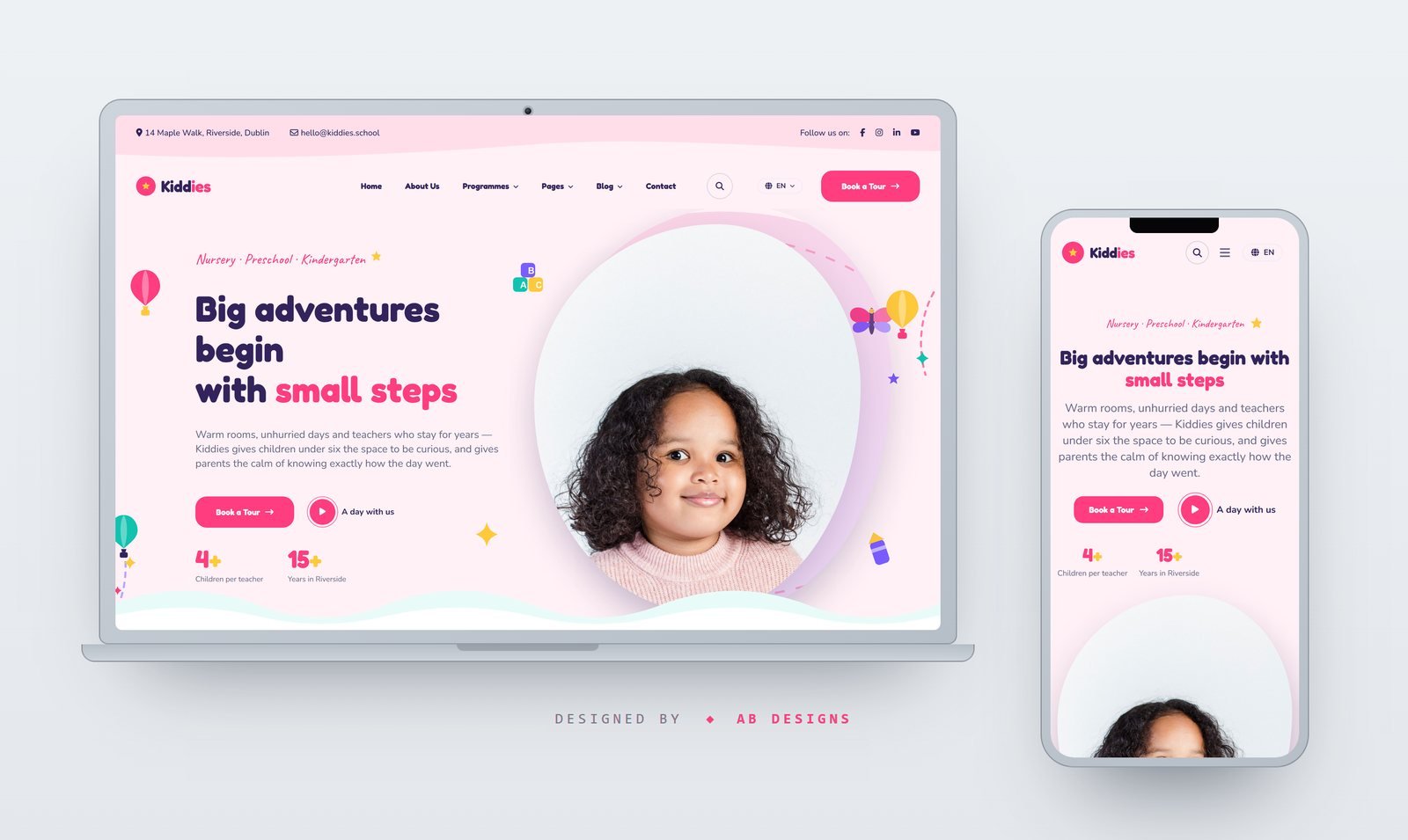
A trilingual (EN/AR/DE) 18-page nursery and kindergarten template with age-group programmes, an enrolment journey, teacher profiles, events and transparent fee tiers. Mobile-first, with a fully mirrored RTL layout.
Kiddies is a complete multi-page front end for nurseries, preschools, kindergartens and early-years centres. Eighteen pages ship ready — home, about, programmes and a programme detail, admissions, events and an event page, teachers and a teacher profile, gallery, fees, FAQ, blog and article, contact, 404, terms and privacy — all sharing one header, footer and design system. The home page runs a hero with a stat strip, a four-step enrolment journey, six age-group rooms, an about block, a teacher carousel, a daily-activities grid, an open-morning banner, parent testimonials, a blog preview, a newsletter panel and an Instagram strip. Every string on every page is translated into English, Arabic and German from a single 291-key dictionary. English is written into the markup, so each page is complete and indexable with JavaScript off; switching is instant and needs no reload, and the choice is remembered between visits or forced with a ?lang= parameter. Arabic is a true mirror rather than a right-aligned copy — the stylesheet was rebuilt on CSS logical properties instead of a separate RTL override file, so margins, padding, borders, insets, floats and alignment all flip on their own, while decorative art, chevrons, wave dividers and gradients are mirrored to match and prices, dates and phone numbers stay left to right. Arabic switches to Baloo Bhaijaan 2 and Tajawal with their own line height; Latin copy uses Fredoka for headings, Nunito for body and Caveat for the handwritten eyebrows. The layout is mobile-first: type and section rhythm are fluid clamp() scales rather than stepped breakpoints, ornaments that only earn their place on a wide screen are switched on with min-width, and every page was checked for horizontal overflow at 390 and 1500 pixels in all three languages. There is no build step and no framework — Bootstrap 5 for the grid, Swiper for the carousels, WOW.js for scroll reveals and Magnific Popup for the gallery. All forty-eight ornaments, the wordmark and the favicon are hand-authored SVG, the icon set is self-hosted, and every photograph is a fresh early-years shot cropped to the exact box the layout expects at 2x for retina.
A bilingual, mobile-first landing page for an online course academy — course cards, live cohorts, instructors and learner stories.
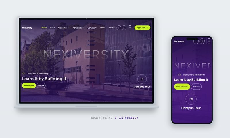
A complete PHP university website in English and Arabic, with working student registration, an online admissions application, and every page driven from a database.
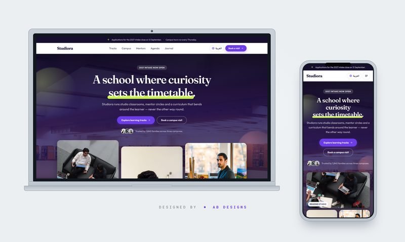
A bilingual (EN/AR) school and academy landing template with true RTL support, studio-style sections, and real photography — no framework dependencies.

Tell us what you are planning. We will come back with an honest view of scope, timeline and cost — before any contract.
SitexPrime — brand film
Leave this window open and the reply appears here. Come back later and the conversation is still waiting.